Government Entity Logos — Introduction
This section defines the official logo system used by ministries, authorities, agencies, commissions, and government programmes of the Republic of Somaliland. It explains how government entity logos are derived from a single, standardised national model, ensuring consistency, clarity, and institutional unity across all State communications.
Government Entity Logos are designed to clearly identify individual institutions without competing with or replacing the State Logo. They operate within a controlled visual hierarchy that reinforces State authority, maintains public trust, and ensures all entities are recognisable as part of one unified government system.
Official Government Entity Logos
Government Entity Logos identify ministries, authorities, commissions, agencies, tenders, programmes, and other official institutions operating under the authority of the Republic of Somaliland. These logos represent institutional responsibility and administrative function, while remaining visually subordinate to the State Logo and aligned with the National Brand Identity system.
All Government Entity Logos are derived from one standard structure using the National Emblem, divider, and institutional wordmark. While the entity name and colour may vary, the structure, proportions, typography, and emblem usage remain consistent to ensure national unity and recognition.
Colour Classification of Government Entities
Colour is used to distinguish levels of government responsibility:
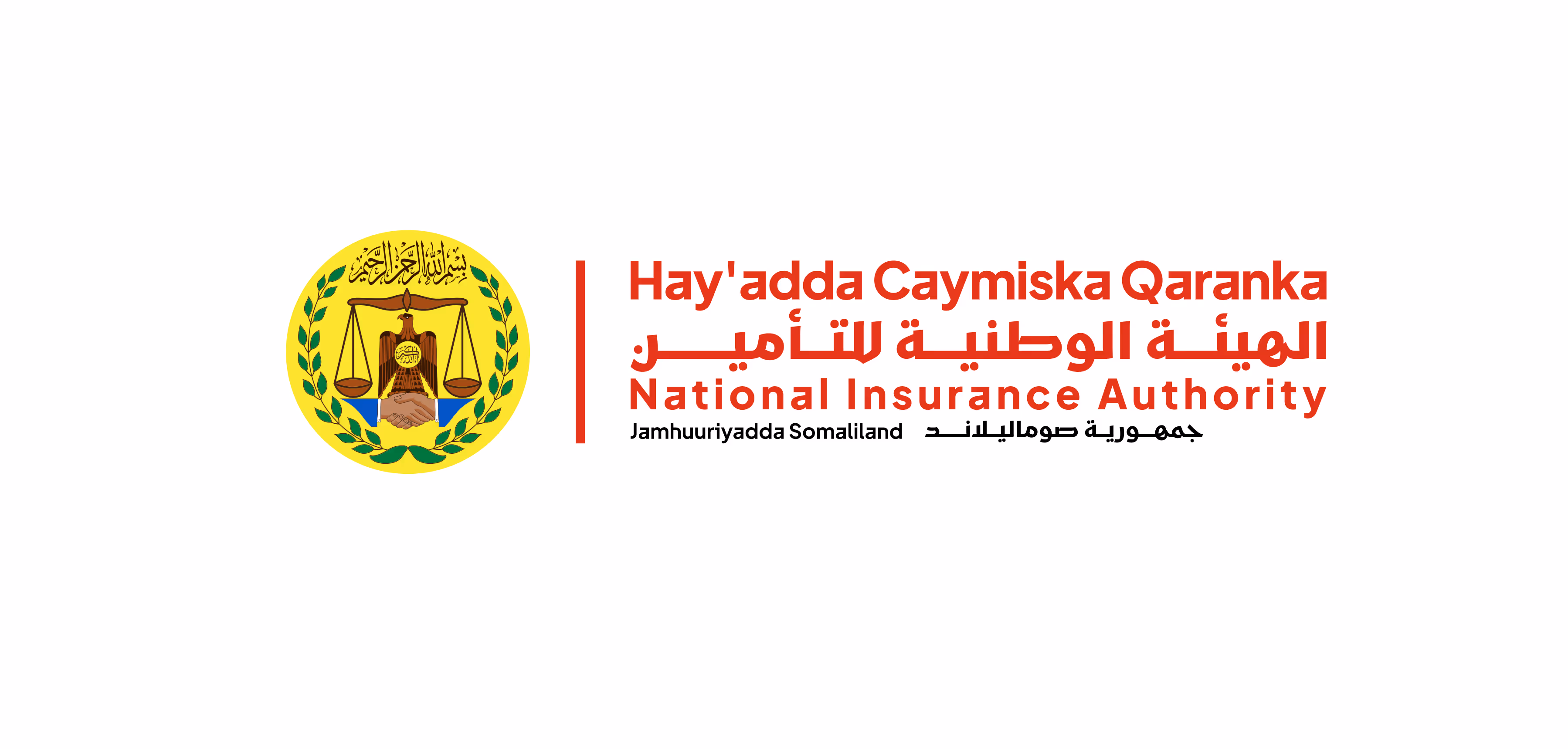
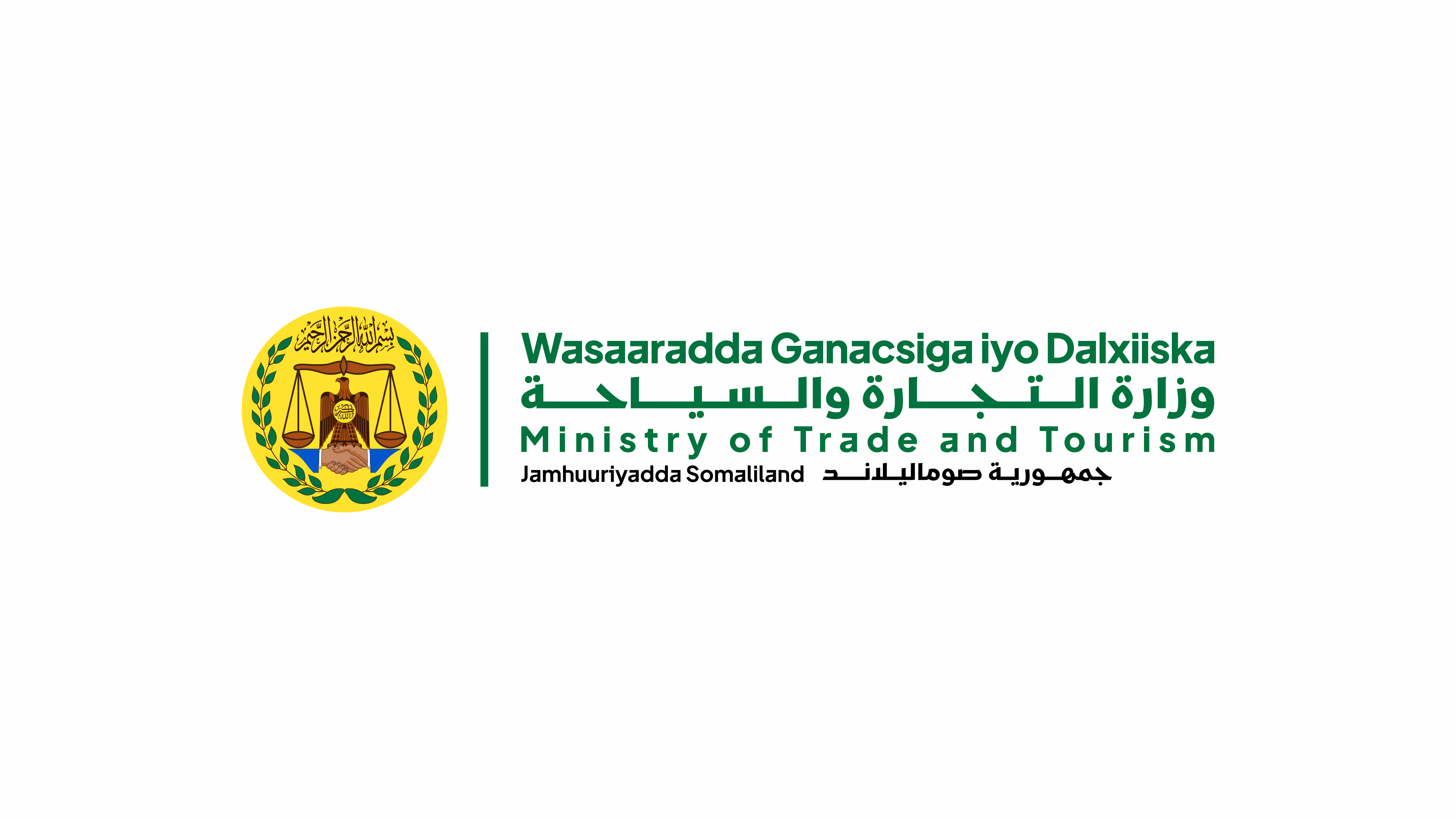
- Green is reserved exclusively for Ministries.
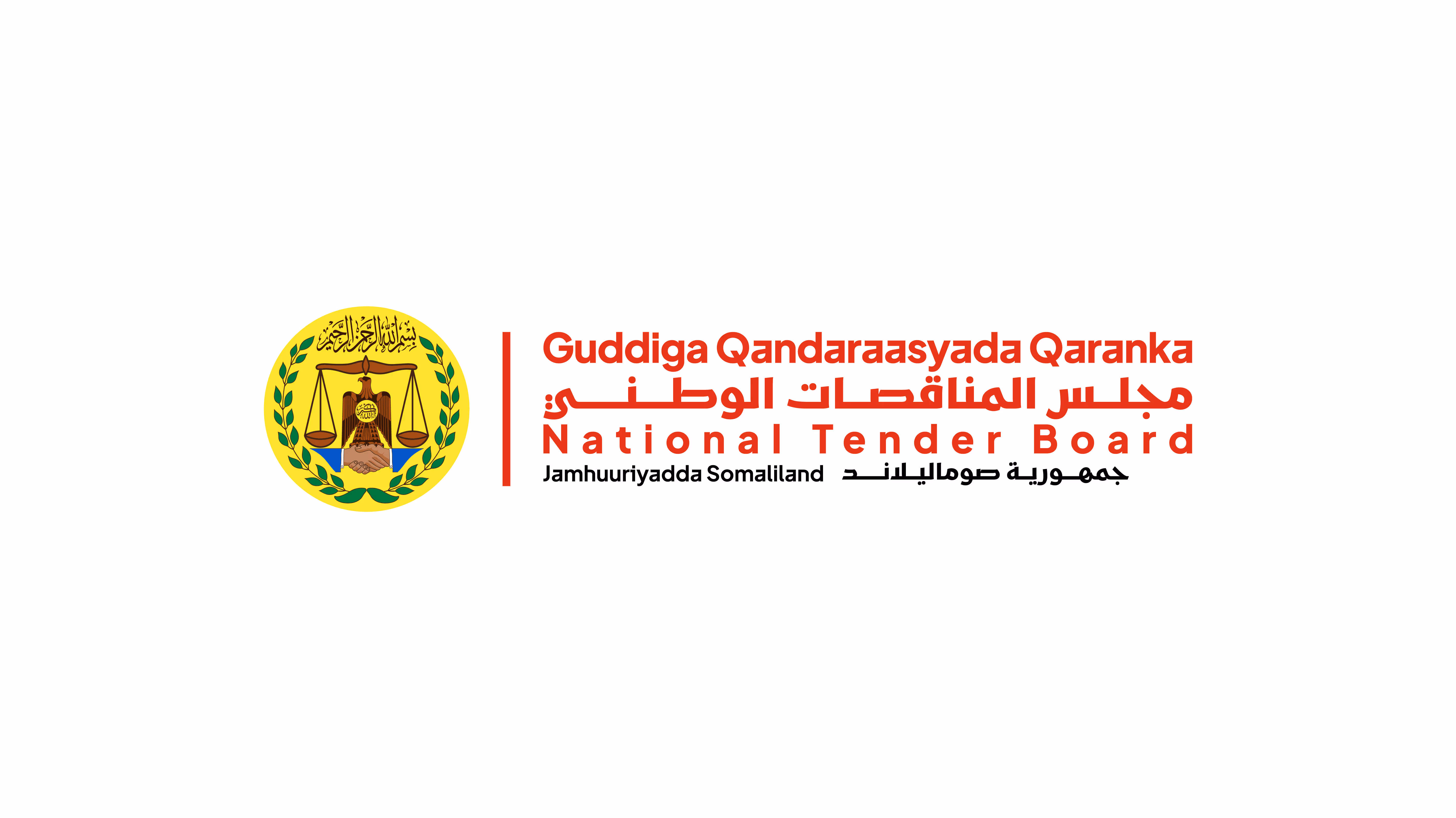
It identifies executive government bodies with constitutional authority and ministerial responsibility. - Red is used for all non-ministerial government entities.
This includes authorities, commissions, boards, tenders, programmes, and regulatory institutions operating under delegated mandate or ministerial oversight.
Key Principle
All Government Entity Logos follow the same structural and visual rules. No entity may change its assigned colour, modify the emblem, or use a style that implies State sovereignty, which is reserved only for the State Logo.

Logo Components
All Government Entity Logos are constructed from a single, standardised set of components. These components establish a clear visual relationship between the State and its institutions and must always be used together in their approved form. No component may be altered, removed, or used independently.
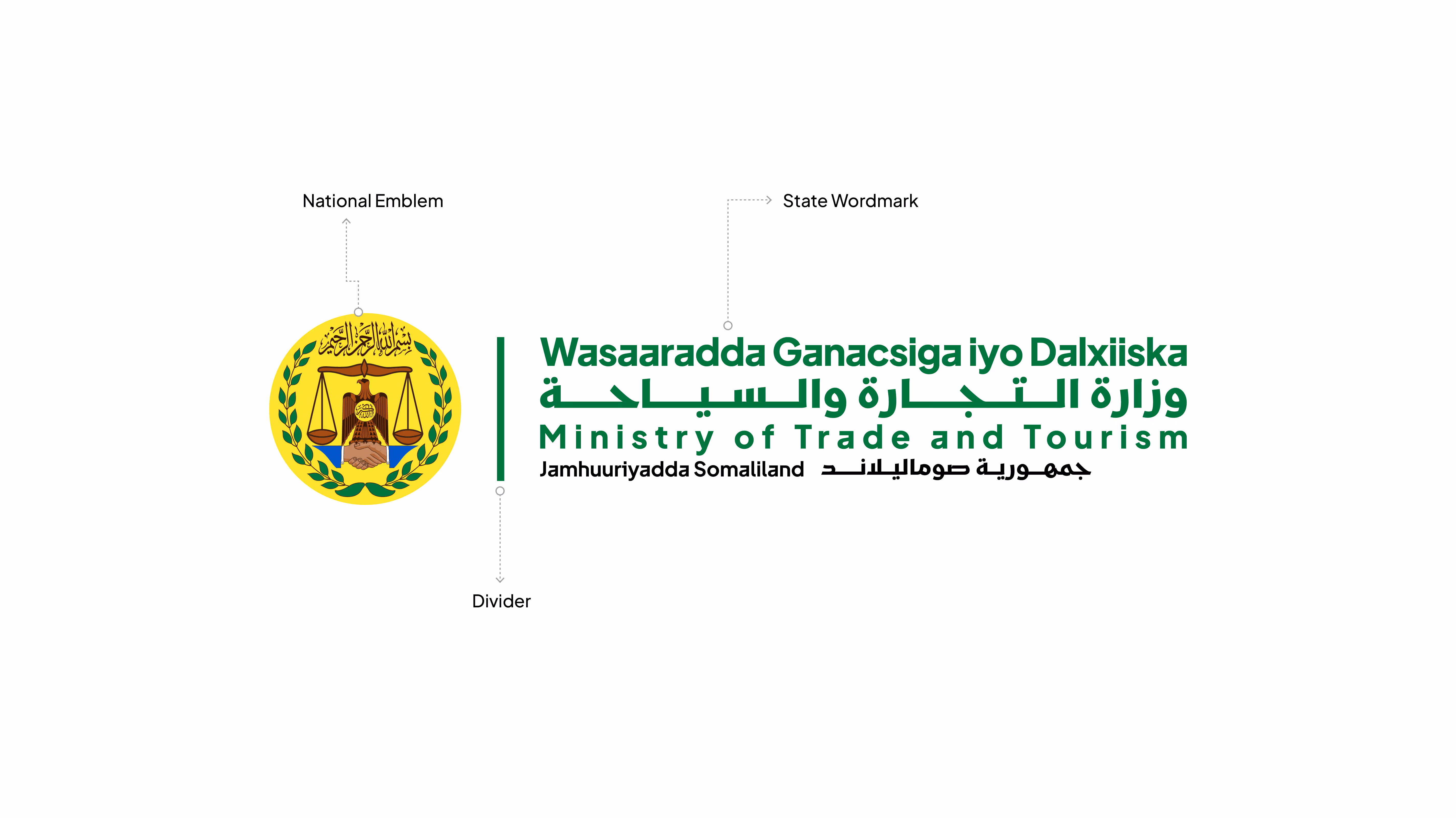
National Emblem
The National Emblem is the primary symbol of authority within the logo. It represents the Republic of Somaliland and visually anchors all government entities to the State. The emblem must always appear in its approved full-colour form and must not be modified, simplified, recoloured, or replaced.
Divider
The vertical divider separates the National Emblem from the entity wordmark and defines the structural balance of the logo. It reinforces visual hierarchy and ensures clear distinction between State authority and institutional identity. Its position, size, and proportions are fixed and must not be altered.
State Wordmark
The Government Entity Wordmark identifies the institution and formally links it to the Republic of Somaliland. It is a single, unified text block with a fixed multilingual structure.
The wordmark contains:
- The entity name in Somali
- The entity name in Arabic
- The entity name in English
- A concluding line reading “Republic of Somaliland” in Somali and Arabic
All lines function as one inseparable unit and must always appear together in their approved order, alignment, and typography. No line may be removed, rearranged, translated differently, or used independently.
Logo Construction & Clear Space
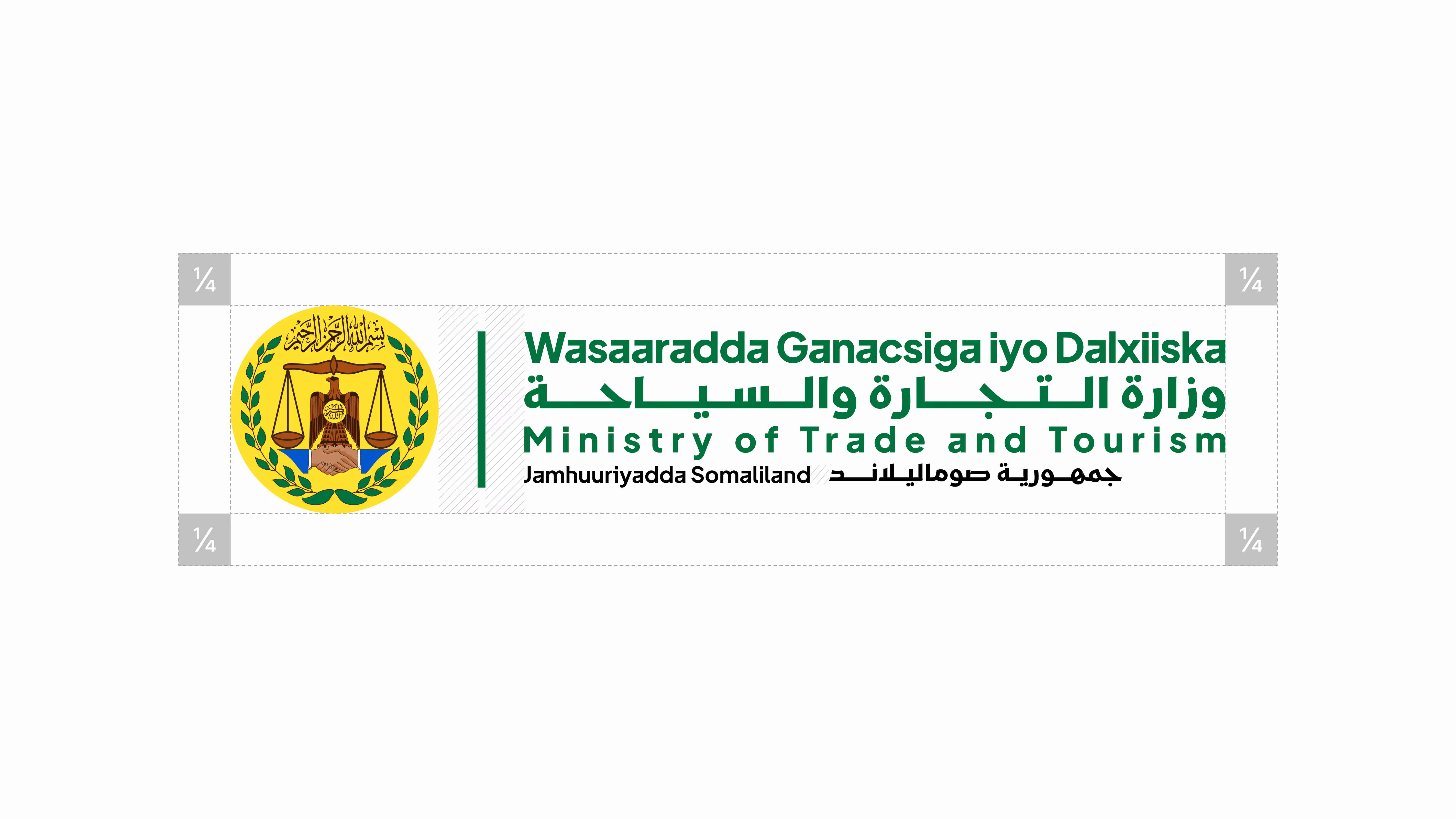
The Government Entity Logo is built on a fixed proportional system derived from the National Emblem. This system ensures consistency, balance, and authority across all ministries and government institutions.
The diameter of the National Emblem (X) is the core reference unit. All alignment, spacing, proportions, and clear-space rules are calculated from this measurement. This construction system mirrors the State Logo logic and applies uniformly across all Government Entity Logos.
Do not redraw, rebuild, resize components, adjust spacing, or modify proportions in any way.
Construction & Proportions
The logo is composed of three aligned elements: the National Emblem, a vertical divider, and the Government Entity Wordmark. Their relationship is fixed and must not be altered.
- Divider height: ¾ × X
- Divider width: 0.04 × X
- Wordmark text block height: ¾ × X
- Horizontal spacing on each side of the divider: 0.19 × X
All elements align on a shared vertical axis to maintain visual balance and hierarchy.
Clear Space
A minimum clear space of E = ¼ × X must be maintained on all sides of the logo.
Clear space is measured from the outermost edge of the logo.
No text, images, borders, or graphic elements may enter this area under any circumstances.
Logo Variations
The Official Government Entity Logo is supplied in two approved formats to support different layout needs while maintaining authority, clarity, and consistency across all ministries and government institutions. Both formats use the same National Emblem, divider, and entity wordmark, follow identical construction rules and proportions, and must always be reproduced from the approved master artwork. Selection of format is based on layout requirements, not preference. Both formats carry the same official status.
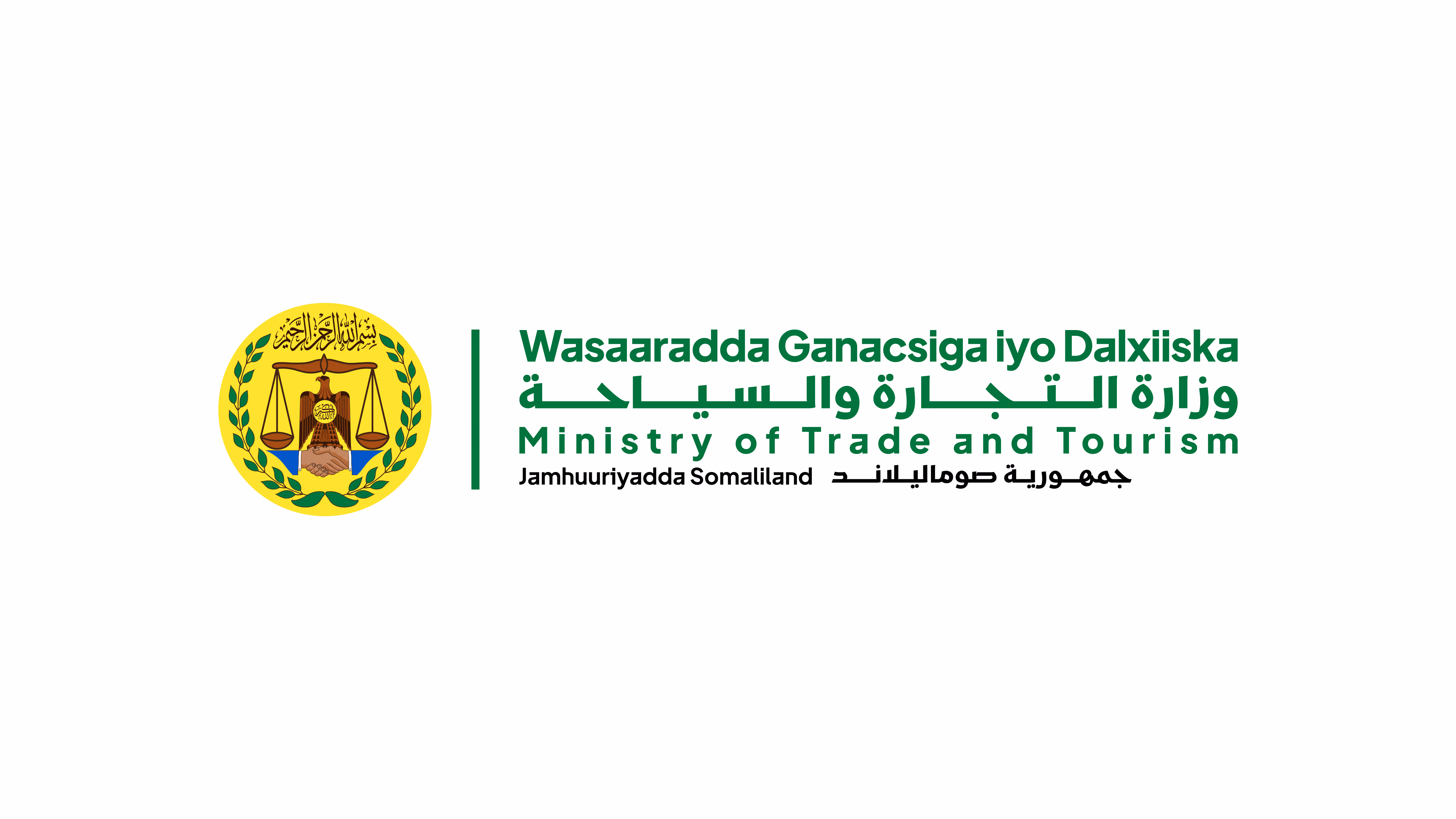
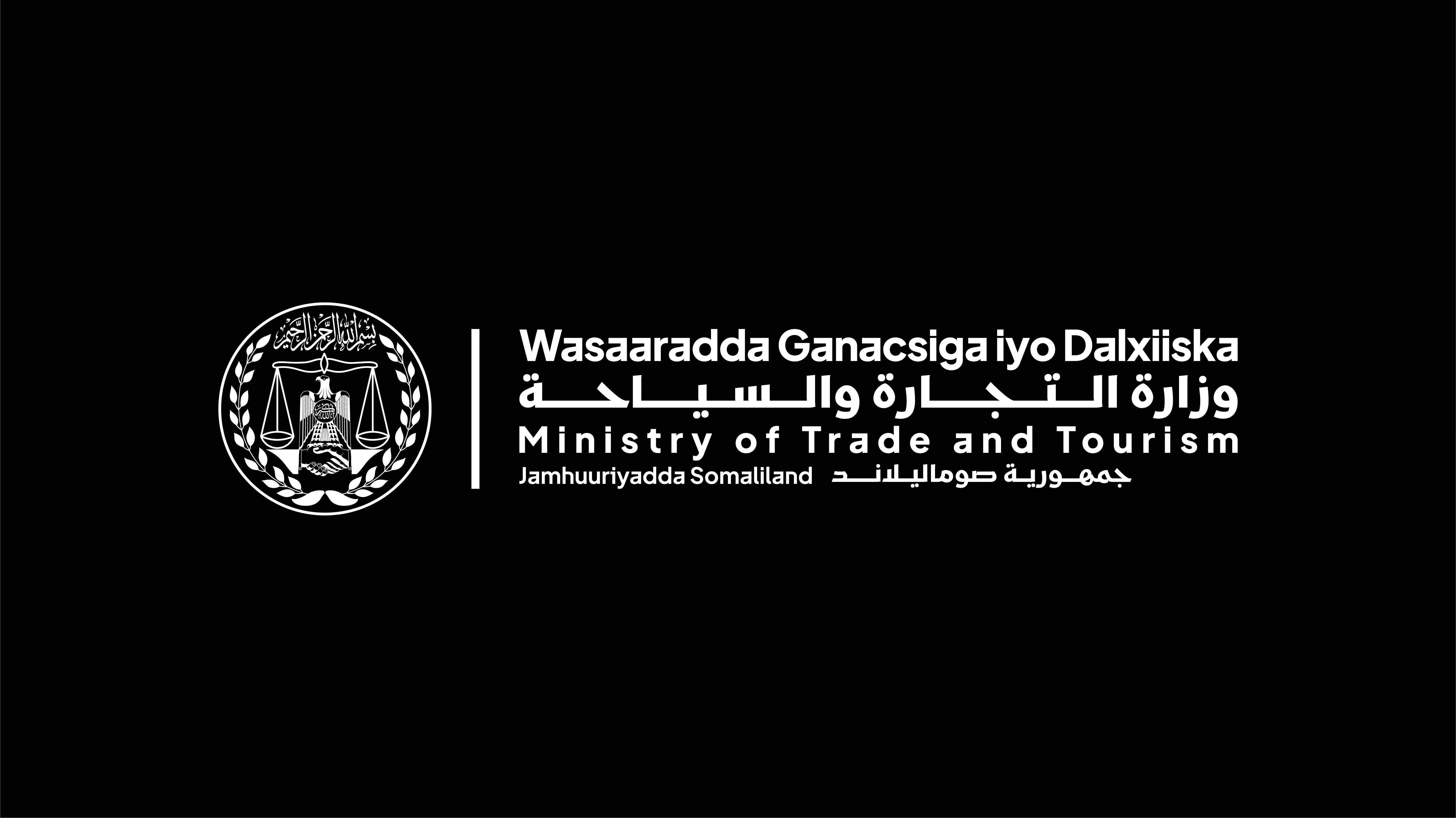
Primary Format (Horizontal)
The preferred and default version for all Government Entity Logos, including ministries. This format should be used whenever sufficient horizontal space is available to display the full logo clearly and with strong institutional presence.
For ministries, the entity wordmark appears in the official ministry green, reinforcing executive authority and ministerial responsibility.
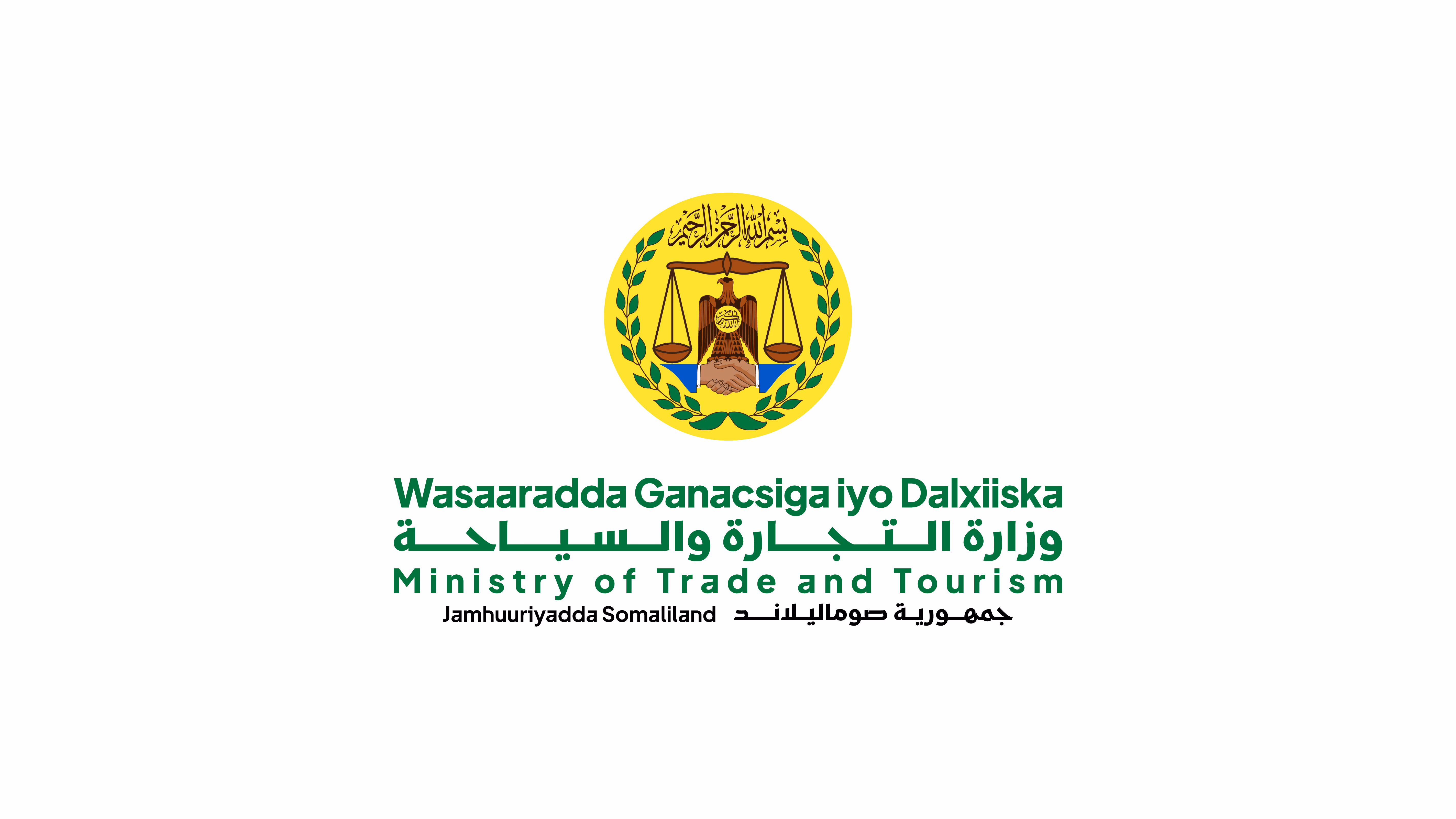
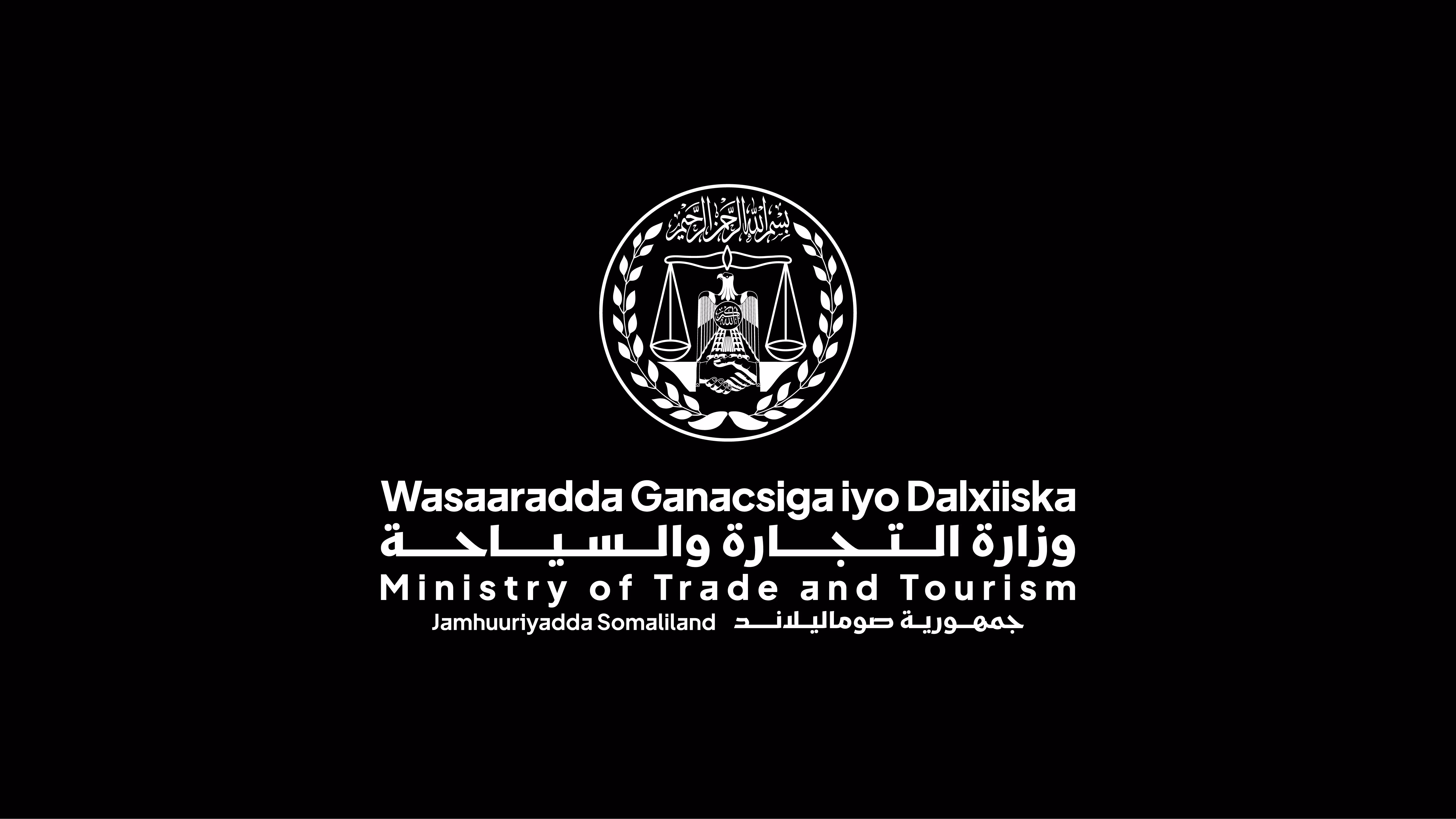
Secondary Format (Stacked)
An alternative approved arrangement used only when space is limited or when vertical layouts are required. This format preserves the same components, hierarchy, and proportions as the Primary Format, arranged vertically for compact applications.
It must not replace the Primary Format when the horizontal version can be used.

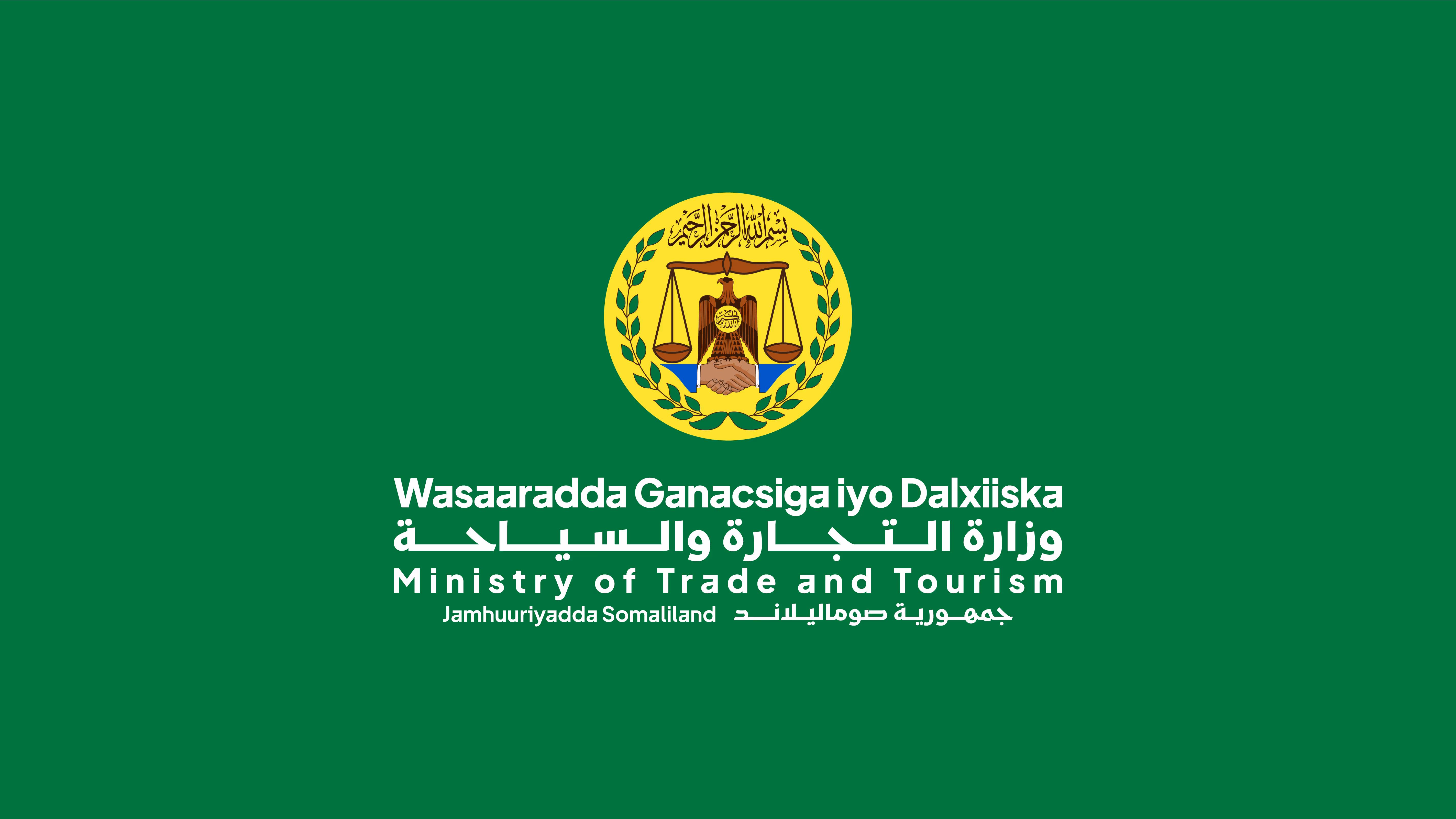
Monochrome and Single-Color Versions
Monochrome and single-colour versions of the Government Entity Logo are provided only for limited production conditions where full-colour reproduction is not possible. These versions preserve the same official structure, proportions, hierarchy, and authority as the full-colour logo and must always be reproduced from the approved master artwork.
Monochrome versions are intended for technical necessity, not preference, such as black-and-white printing, stamping, engraving, or low-cost production environments. When colour reproduction is available, the full-colour Government Entity Logo must always be used, and monochrome versions must not replace it.


Non-Ministerial Entity
Monochrome and single-colour versions of the Government Entity Logo are provided only for limited production conditions where full-colour reproduction is not possible. These versions preserve the same official structure, proportions, hierarchy, and authority as the full-colour logo and must always be reproduced from the approved master artwork.
Monochrome versions are intended for technical necessity, not preference, such as black-and-white printing, stamping, engraving, or low-cost production environments. When colour reproduction is available, the full-colour Government Entity Logo must always be used, and monochrome versions must not replace it.